How to Make Histogram with Plotly
Let’s build a histogram!
Import Data
import pandas as pd
from plotly import express as px

url = "https://raw.githubusercontent.com/PhilChodrow/PIC16B/master/datasets/palmer_penguins.csv"
penguins = pd.read_csv(url)
The Basic Information of Data
We should always check waht are the variables in our data, and the total number of observations
penguins.head()
| studyName | Sample Number | Species | Region | Island | Stage | Individual ID | Clutch Completion | Date Egg | Culmen Length (mm) | Culmen Depth (mm) | Flipper Length (mm) | Body Mass (g) | Sex | Delta 15 N (o/oo) | Delta 13 C (o/oo) | Comments | |
|---|---|---|---|---|---|---|---|---|---|---|---|---|---|---|---|---|---|
| 0 | PAL0708 | 1 | Adelie Penguin (Pygoscelis adeliae) | Anvers | Torgersen | Adult, 1 Egg Stage | N1A1 | Yes | 11/11/07 | 39.1 | 18.7 | 181.0 | 3750.0 | MALE | NaN | NaN | Not enough blood for isotopes. |
| 1 | PAL0708 | 2 | Adelie Penguin (Pygoscelis adeliae) | Anvers | Torgersen | Adult, 1 Egg Stage | N1A2 | Yes | 11/11/07 | 39.5 | 17.4 | 186.0 | 3800.0 | FEMALE | 8.94956 | -24.69454 | NaN |
| 2 | PAL0708 | 3 | Adelie Penguin (Pygoscelis adeliae) | Anvers | Torgersen | Adult, 1 Egg Stage | N2A1 | Yes | 11/16/07 | 40.3 | 18.0 | 195.0 | 3250.0 | FEMALE | 8.36821 | -25.33302 | NaN |
| 3 | PAL0708 | 4 | Adelie Penguin (Pygoscelis adeliae) | Anvers | Torgersen | Adult, 1 Egg Stage | N2A2 | Yes | 11/16/07 | NaN | NaN | NaN | NaN | NaN | NaN | NaN | Adult not sampled. |
| 4 | PAL0708 | 5 | Adelie Penguin (Pygoscelis adeliae) | Anvers | Torgersen | Adult, 1 Egg Stage | N3A1 | Yes | 11/16/07 | 36.7 | 19.3 | 193.0 | 3450.0 | FEMALE | 8.76651 | -25.32426 | NaN |
penguins.shape
(344, 17)
Data cleanning
penguins = pd.read_csv(url)
penguins = penguins.dropna(subset = ["Body Mass (g)", "Sex"])
penguins["Species"] = penguins["Species"].str.split().str.get(0)
penguins = penguins[penguins["Sex"] != "."]

cols = ["Species", "Island", "Sex", "Culmen Length (mm)", "Culmen Depth (mm)", "Flipper Length (mm)", "Body Mass (g)"]
penguins = penguins[cols]
penguins.head()
| Species | Island | Sex | Culmen Length (mm) | Culmen Depth (mm) | Flipper Length (mm) | Body Mass (g) | |
|---|---|---|---|---|---|---|---|
| 0 | Adelie | Torgersen | MALE | 39.1 | 18.7 | 181.0 | 3750.0 |
| 1 | Adelie | Torgersen | FEMALE | 39.5 | 17.4 | 186.0 | 3800.0 |
| 2 | Adelie | Torgersen | FEMALE | 40.3 | 18.0 | 195.0 | 3250.0 |
| 4 | Adelie | Torgersen | FEMALE | 36.7 | 19.3 | 193.0 | 3450.0 |
| 5 | Adelie | Torgersen | MALE | 39.3 | 20.6 | 190.0 | 3650.0 |
We have total 344 obseravtions, and 17 variables in this data set.
More About the Data
For example, I am interested in how many observations of different species of penguins, we could use groupby () to achieve it.
penguins.groupby("Species").count()
| Island | Sex | Culmen Length (mm) | Culmen Depth (mm) | Flipper Length (mm) | Body Mass (g) | |
|---|---|---|---|---|---|---|
| Species | ||||||
| Adelie | 146 | 146 | 146 | 146 | 146 | 146 |
| Chinstrap | 68 | 68 | 68 | 68 | 68 | 68 |
| Gentoo | 119 | 119 | 119 | 119 | 119 | 119 |
Make a histgram plot by use plotly
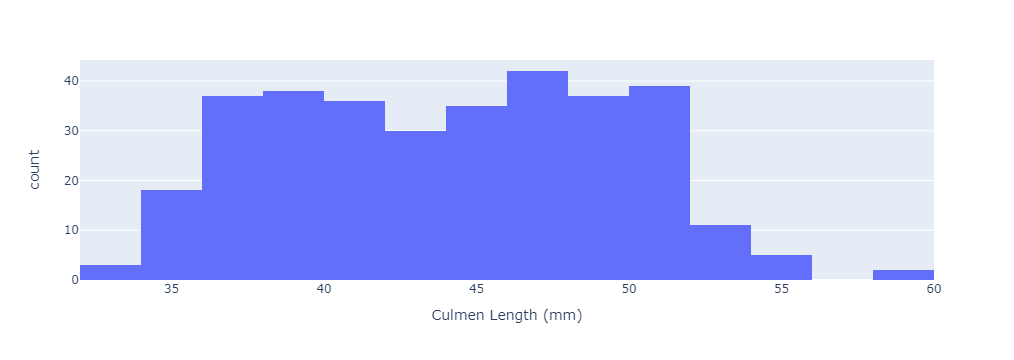
A histogram is the most commonly used graph to show frequency distributions. To plot a simple histogram, we need a data frame, and a variable you want to observe.
fig = px.histogram(data_frame = penguins,
                   x = "Culmen Length (mm)",
                   )

# show the plot
fig.show()

The plot looks too simple, let’s add more components:
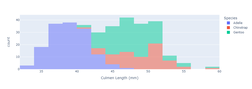
- the **color** argument takes a name of a column in data_frame and uses it to assign a color to the plot. Here, we want to assign different colors with respect to different species of penguins. Using this argument will also create a legend.
- the color of bars looks too bright, then we could use **opacity** argument which takes value from 0 to 1 to adjust the transparency
fig = px.histogram(data_frame = penguins,
                   x = "Culmen Length (mm)",
                   color = "Species",
                   opacity = 0.5
                   )

# show the plot
fig.show()

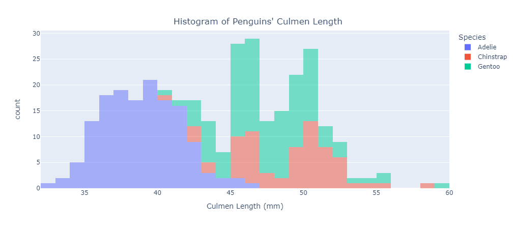
Now, our plot looks a little better than the first version, but it may look too wide compared to its height. So by using width and height arguments, we could adjust the ratio of the plot. Also, using nbins can set the bins we want to show in the plot
fig = px.histogram(data_frame = penguins,
                   x = "Culmen Length (mm)",
                   color = "Species",
                   opacity = 0.5,
                   nbins = 30,
                   width = 900,
                   height = 450,
                   barmode='stack'
                   )

# show the plot
fig.show()

Finally, add a title to the plot
fig = px.histogram(data_frame = penguins,
                   x = "Culmen Length (mm)",
                   color = "Species",
                   opacity = 0.5,
                   nbins = 30,
                   width = 900,
                   height = 450,
                   barmode='stack'
                   )

# set title and its alignment
fig.update_layout(title_text="Histogram of Penguins' Culmen Length", title_x=0.5, title_y=0.92)
# show the plot
fig.show()
